People-focused
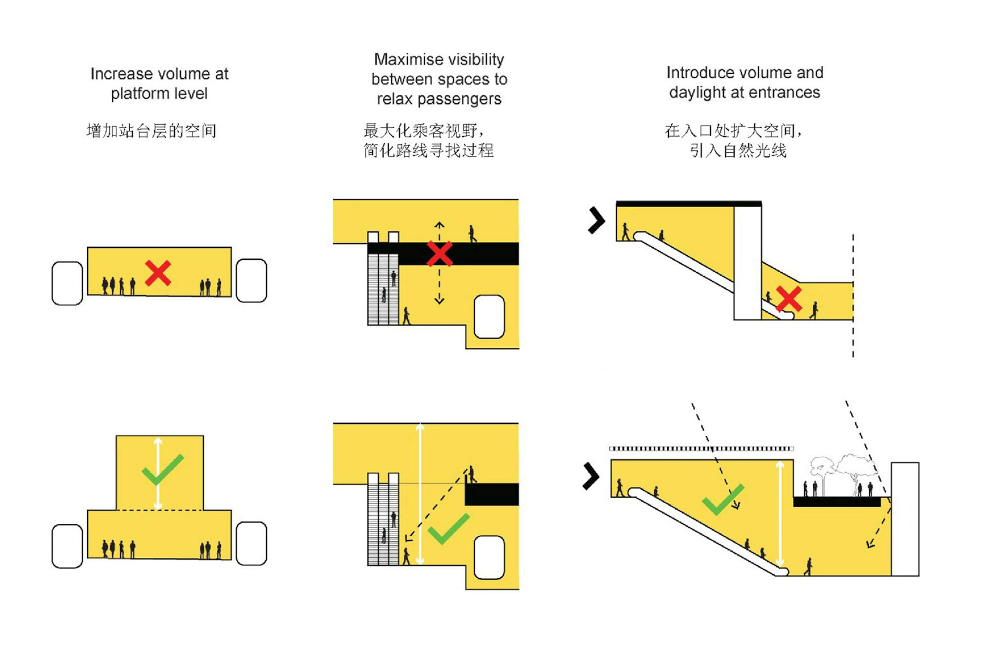
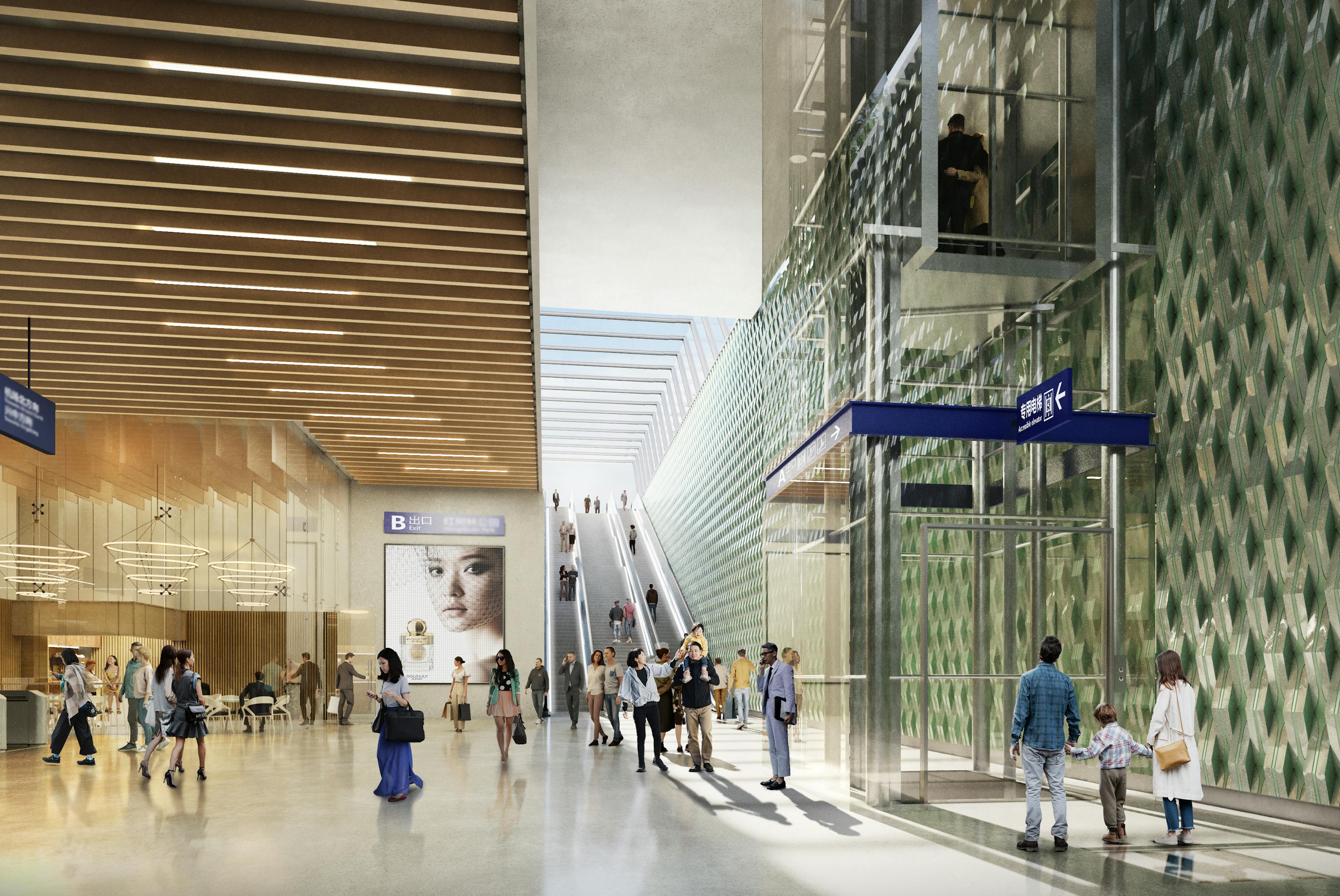
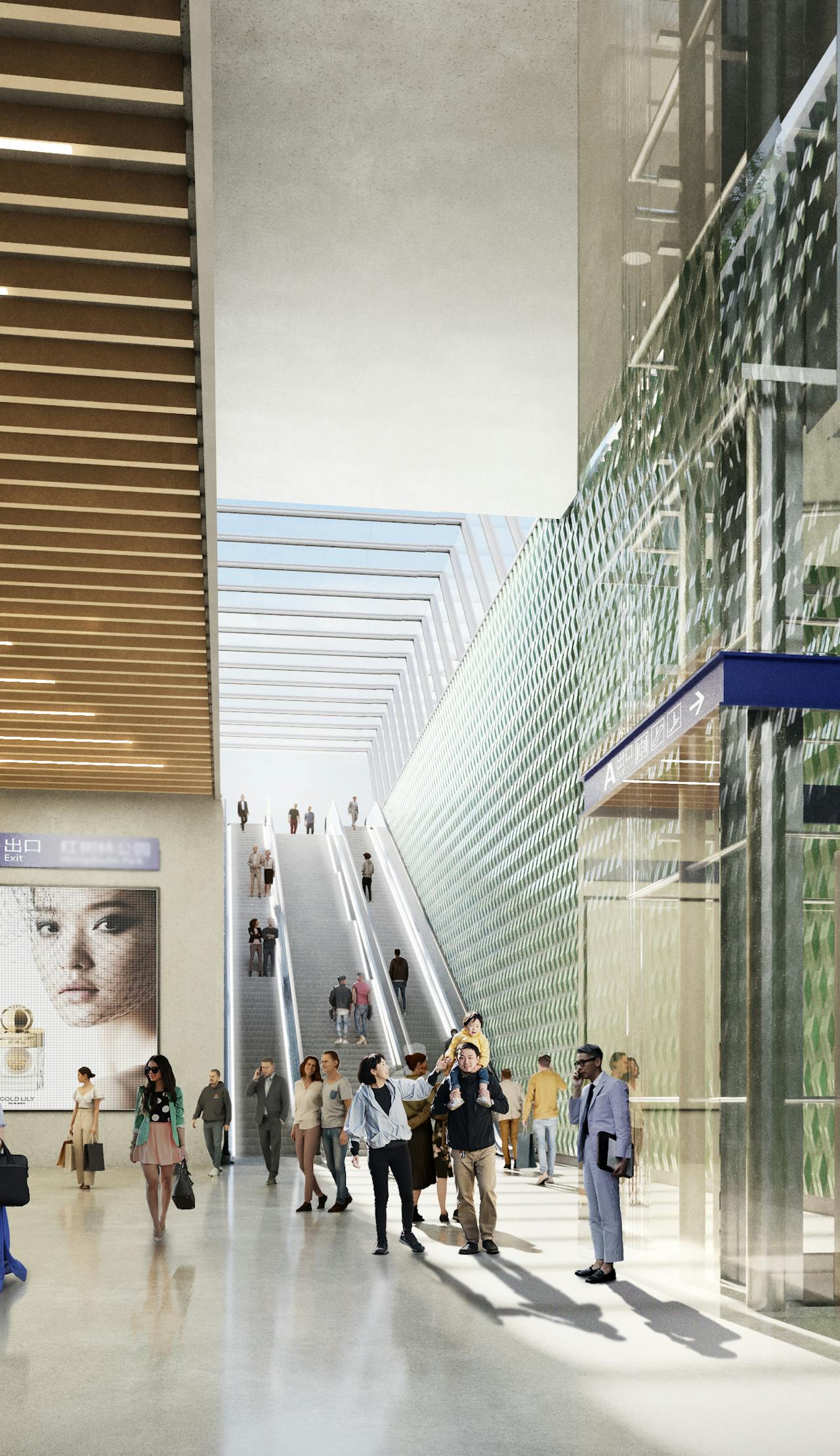
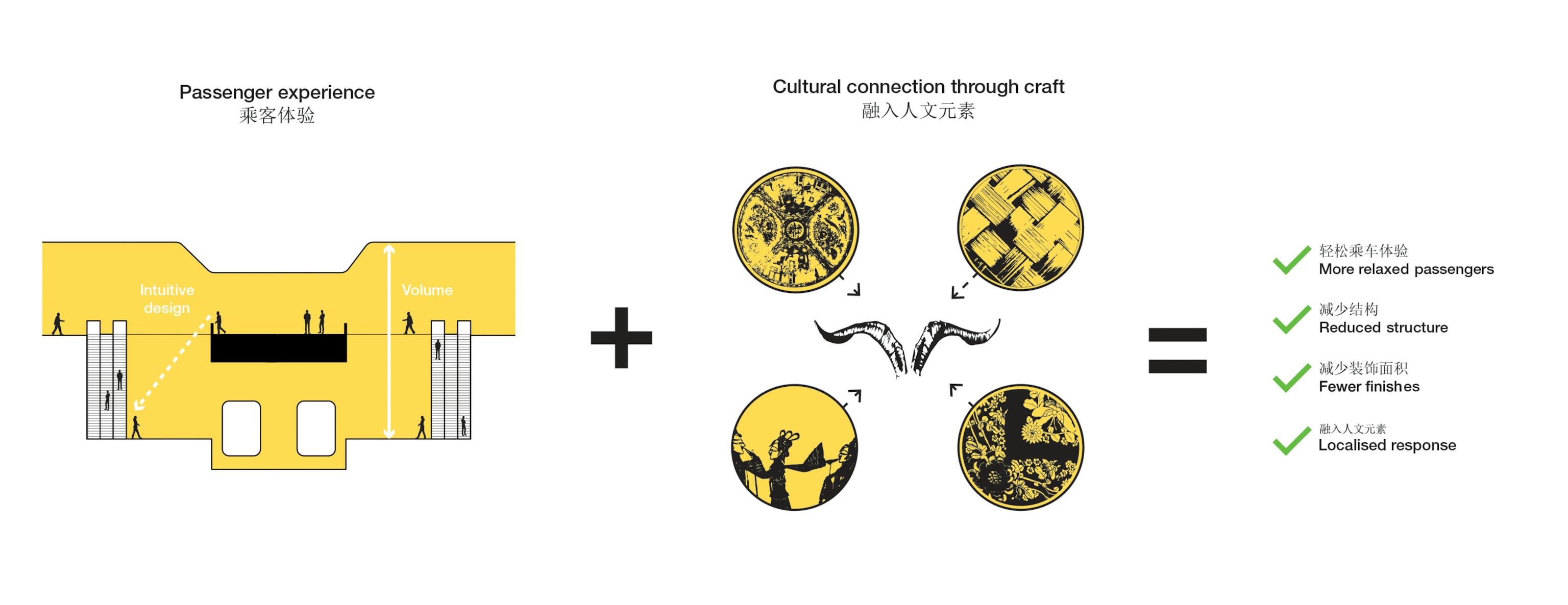
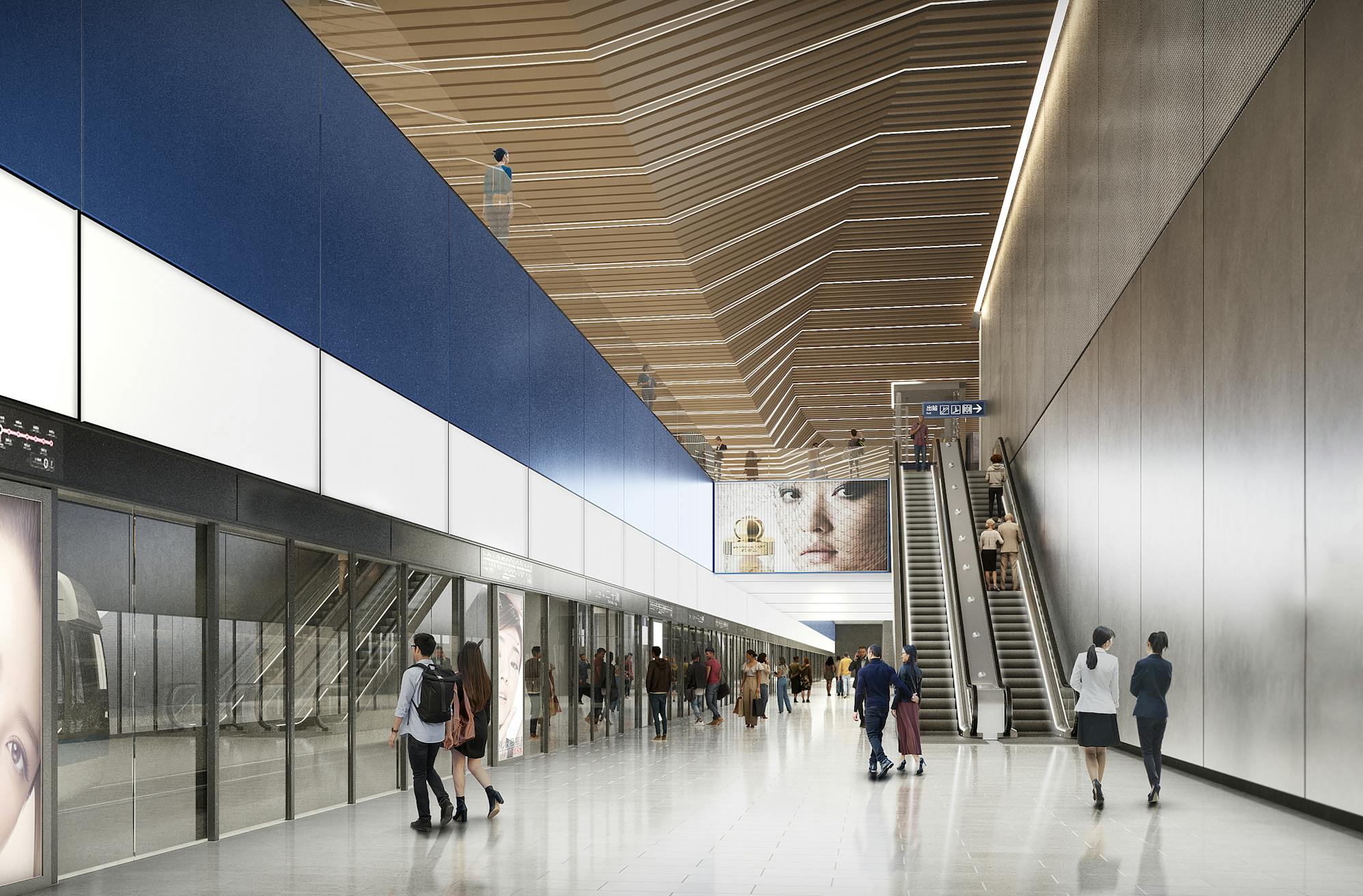
Vertical circulation and passenger movements were rationalised in order to create a relaxed, intuitive passenger experience. Feature walls draw users towards key points of exit and entrance whilst the soffit within the station box increases in volume at decision points.

Inventive
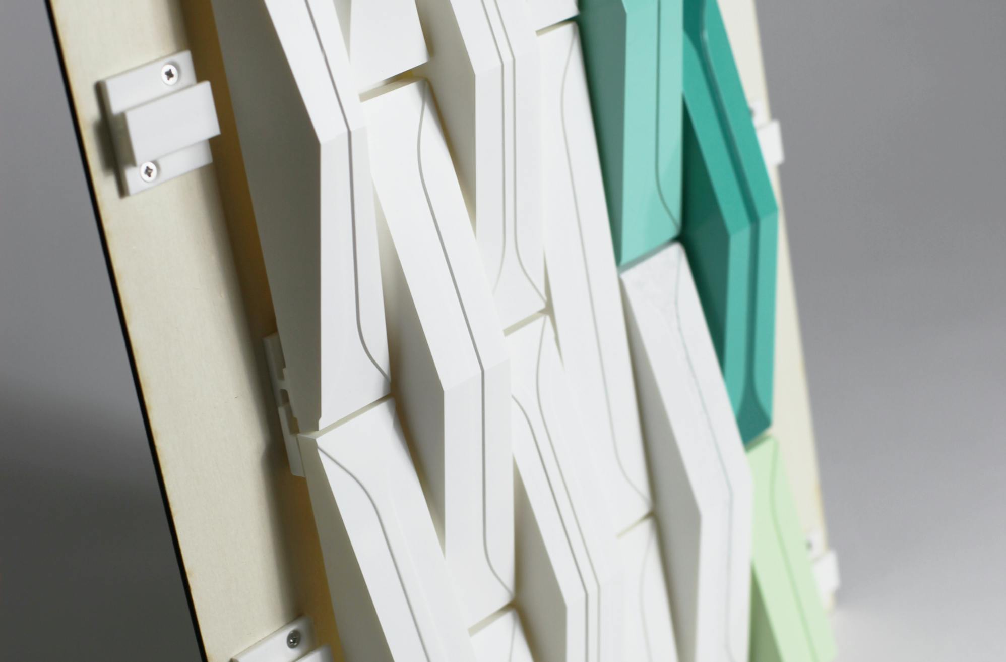
The station feature walls incorporate the region's association with craft and ceramics, as well as showing the city symbol, a goat. A series of models were developed at 1:20 scale to test the best way to deliver the desired faceted wall.
Responsible
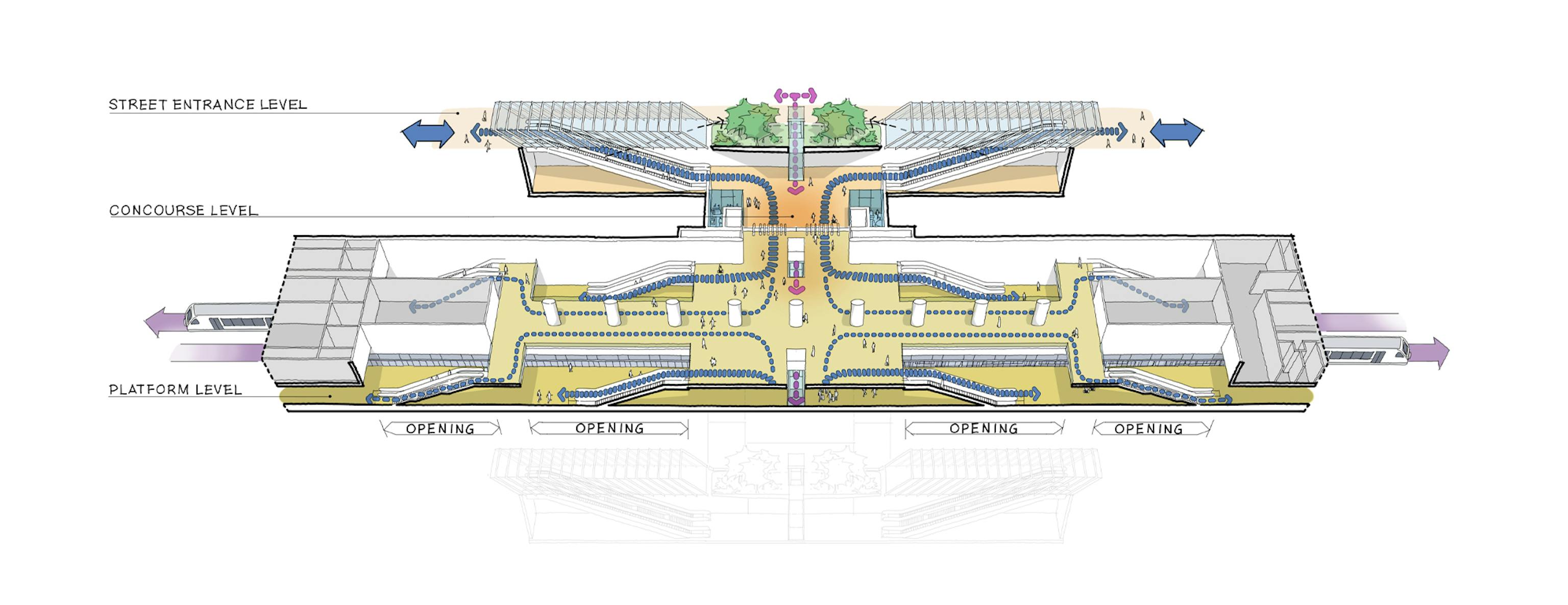
Within the fixed metro box, our strategy looked to reduce material usage. This was achieved by increasing voids, eliminating and consolidating unnecessary circulation. Natural light is maximised within the entrance locations, and intuitive wayfinding allows for additional station signage to be minimised.
Sketchbook
